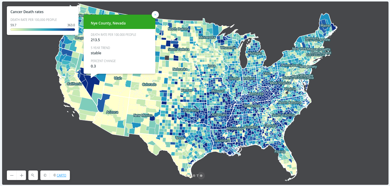
Cancer Death Rate map
The data describe cancer rates for all cancer sites by mortality, for all races, sexes, and ages, averaged over the years of 2009 - 2013. Rates are the number of deaths per 100,000 people.
Tools used
- JSON file
- CARTO
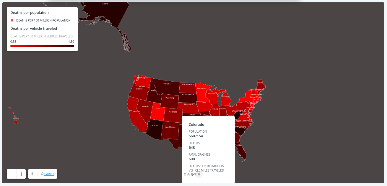
Death by vehicle accident
Fatality facts 2017 State by state. Analysis of fatality vehicle death rates per state and per vehicle miles traveled in USA. relative to the population.
Tools used
- JSON file
- CARTO

Course story map
ArcGIS story maps inspire me to create story map with leafletjs. The idea is to add different map modules in one page as a story map that users can see each map story.
Tools used
- JSON file
- Leafletjs
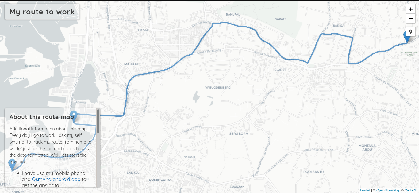
My route
Every day I go to work I ask my self, why not to track my route from home to work? just for the fun and check how is the data formatted and visualize the data on webmap. Well, lets start the gps fun.
Tools used
- Converted GPS data into JSON file
- Leafletjs
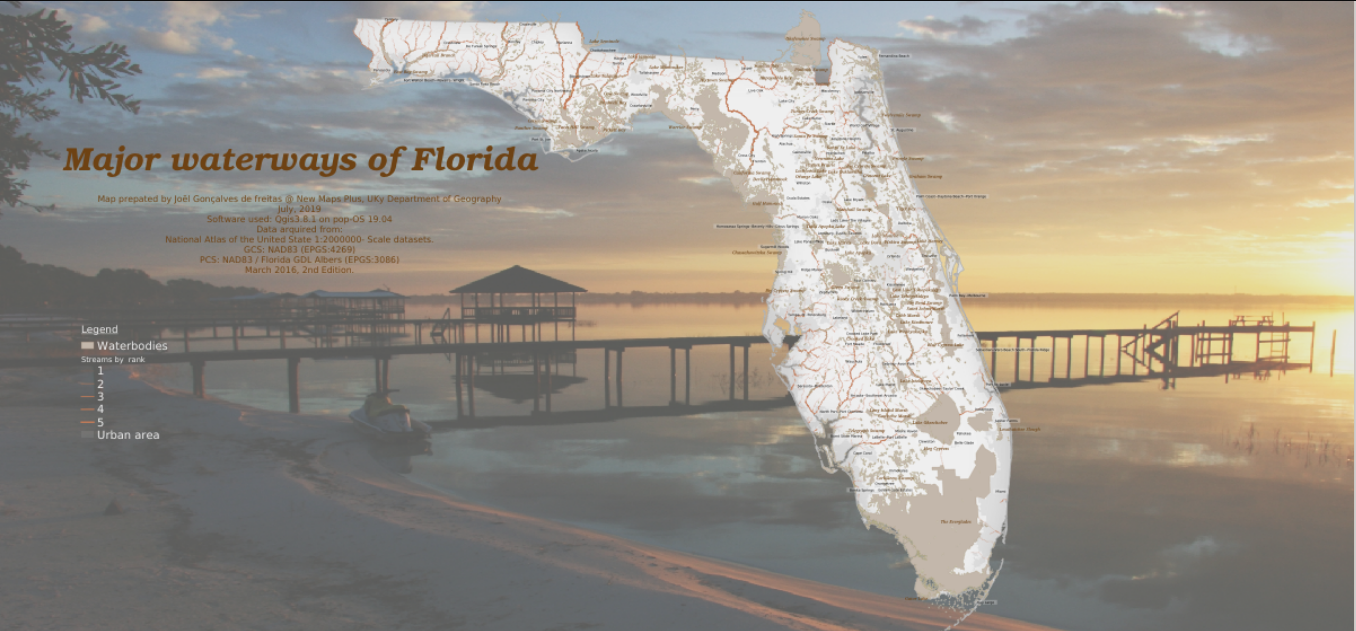
Florida waterways
This map layer contains waterbodies, water steams and urban areas of Florida. The propose of this map is for geographic display and analysis at large regional areas. The data should be displayed and analyzed at scales appropriate for 1:1,000,000-scale data.
Tools used
- QGIS
- PostgreSQL
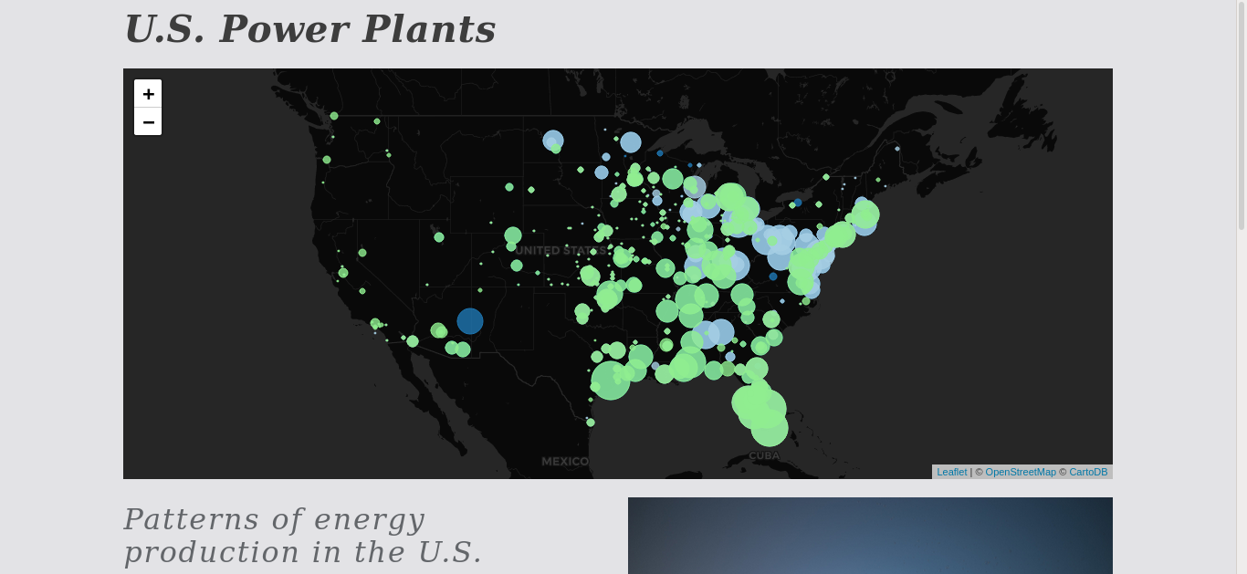
U.S. power plants
The USA power plants map shows the pattern of the energy production. Energy in the United States comes mostly from fossil fuels according to the data from 2010. The data showed that 25% of the nation's energy originates from petroleum, 22% from coal, and 22% from natural gas. Nuclear energy supplied 8.4% and renewable energy supplied 8%.
Tools used
- JSON file
- Leafletjs
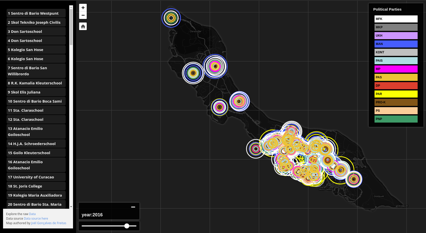
mapping the Curacao elections
content here
Tools used
- Qgis 3.12
- LibreOffice
- csv file
- mapbox omnivore
- mapbox Assembly.css
- Leafletjs